Save the Trillium
John Tory, the leader of Ontario’s Conservative Party, is angry. Dalton McGuinty’s Liberal government commissioned a new logo for Ontario, and Tory doesn’t like it:
“What we have here is the tried and true traditional trillium being replaced by the partisan political pork-barrel poison-ivy look-alike, and I think they should put a stop to it right away.”
He’s so upset he’s launched a website called Save the Trillium. Tory is not content just to protect the trillium from heedless hikers and flora filchers. He’s taking aim at the trillium’s most serious threat: liberal graphic designers.
Ontario’s trillium has long been the symbol of hope and opportunity for all. The classic T-shaped logo was first used by the Ontario government more than 40 years ago. It’s been used no matter which political party was in power.
That is, until now.
Now Dalton McGuinty and the Liberals have changed the logo to more closely resemble the Liberal Party logo.*cue ominious organ chord*
[Emphasis in the original. Organ chord added.]
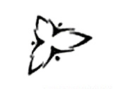
Let’s take a look. This is Ontario’s new trillium logo:

And here is the Ontario Liberal Party logo:

At first glance, they may not seem similar. But if you stare at these long enough – and John Tory has – your screen will go black and a large Microsoft Windows logo will start to appear in random locations – shit. Where was I…oh yeah:
- The new trillium logo is black and white. There are black people and white people in the Liberal logo.
- The trillium in the new logo has three petals. So does the trillium in the Liberal logo.
- The direction of the petals in the new logo is distinctly partisan. Two petals point left, and only one points right. The previous logo, where one pointed left, one pointed right, and the third, representing the NDP, pointed straight down, more accurately reflects Ontario’s political traditions.
[tags]politics, Ontario, liberals that have no regard for tradition or vegetation[/tags]

 Big, black and juicy: just the way I like ’em
 A favourite of robins, serviceberries taste the way they look: like red blueberries
 twitter.com/adriandz
